Displaying Extreme Events Statistics Probability Plots
Extreme events statistics are displayed as probability plots.
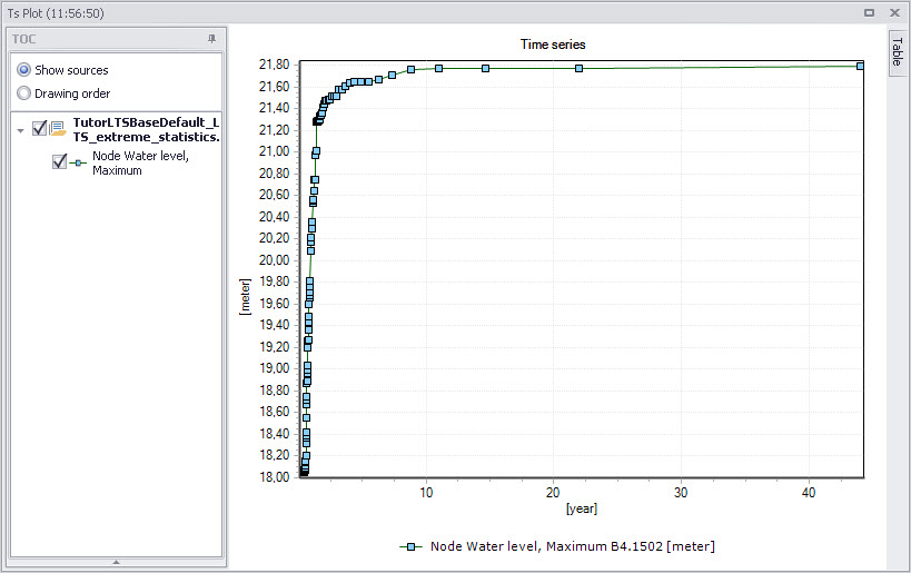
Figure: Probability plot shows ranked extreme values in reverse order (from smallest to largest, plotted against approximated recurrence interval (calculated as simulation period divided by rank)
X-axis: Recurrence interval in years.
Y-axis: Value units are displayed according to the type of variable plotted.
The user can modify plot data series colors, line thickness, marker type, etc.